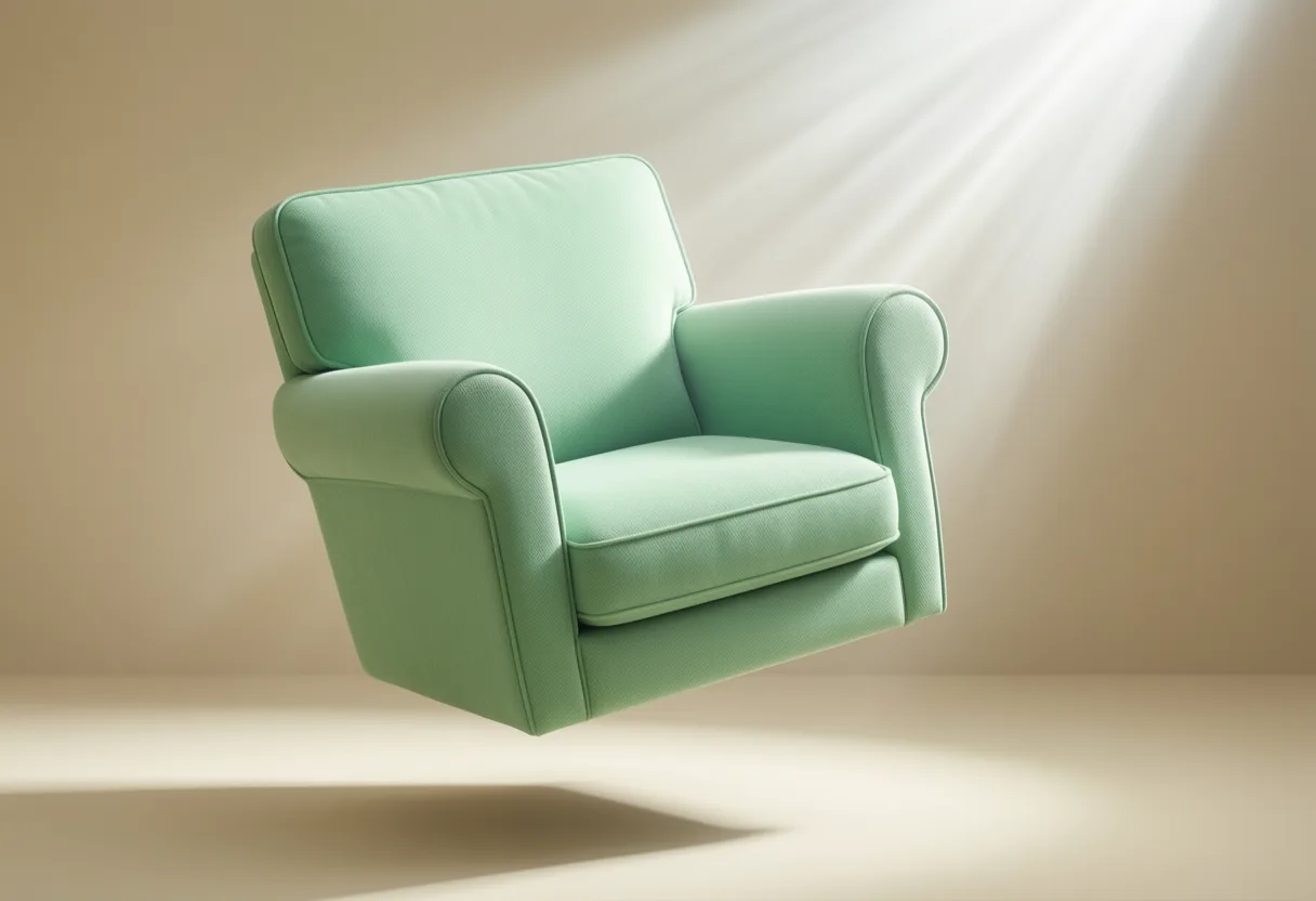
Pastel green Isn’t just a color. It’s a breath. A pause. A quiet rebellion against the noise.
In a world that never stops screaming for attention, choosing pastel green for your Space Is a power move. It says you’re in control - calm, centered, and sharp. But you don’t stop at one color. You build a mood. A sanctuary. Here’s how.

7 Perfect Color Pairings for a Serene Pastel Green Palette
Color isn’t decoration. It’s psychology. It’s energy. And when you’re building a space that fuels focus without frying your nerves, pairing Pastel green Right is non-negotiable.
This isn’t about Trends. It’s about Intention. You want soft? You want calm? Then you treat color like a tool - not a toy.
1. Crisp White
White opens the room. Literally. It reflects light, amplifies space, and lets pastel green breathe. Think white walls, white trim, white linen. It’s the ultimate neutral - clean, quiet, and strong. No clutter. No noise. Just clarity.
Pair this combo in home offices or reading nooks. The green soothes. The white sharpens. Together, they create mental space - the kind you need when you’re grinding toward a goal.
2. Warm Beige
Beige isn’t boring. Not when you use it right. A warm beige brings earthiness to pastel green, grounding its airy lightness. It’s like sunlight hitting a forest floor - soft, natural, alive.
Use beige in furniture, rugs, or textured throws. It adds depth without weight. This pairing works in living rooms or bedrooms where comfort meets quiet focus.
3. Soft Gray
Cooler than beige, but never cold. Soft gray tempers pastel green with a modern edge. It’s sleek. Refined. The kind of combo you see in high-end spas - because it Works.
Go for gray upholstery or window frames. Avoid anything too blue-toned - that’s where the chill creeps in. Stick to warm grays, and you keep the calm without losing warmth.
4. Pale Blush Pink
Don’t laugh. Blush and pastel green? Yes. They’re opposites on the wheel - but in pastel form, they balance. One cools. One warms. Together, they feel gentle, never cloying.
This works in creative spaces - studios, dressing rooms, meditation corners. It’s subtle femininity with backbone. Not sweet. Serene.
5. Cream
Cream is softer than white. Richer. It’s like light wrapped in butter. When you pair it with pastel green, you get a space that feels lived-in from day one.
Use cream in walls or bedding. It avoids the sterility of bright white while keeping things airy. Perfect for bedrooms where you want rest - not hospital vibes.
6. Muted Terracotta
Earthy. Grounded. Terracotta adds a pulse to pastel green. It’s the whisper of fire in a cool room. Not loud. Just present.
Tile floors, ceramic accents, or a single terracotta chair - that’s all it takes. This combo pulls you into your body. Great for spaces where you need to feel - not just think.
7. Dusty Lavender
Lavender brings stillness. Pastel green brings balance. Together, they’re a one-two punch for anxiety. This isn’t a party palette. It’s a recovery zone.
Use in bathrooms or reading corners. A lavender throw on a pastel green sofa? That’s a reset button. Simple. Strategic.
Beyond the Basics: How Lighting Changes Color Perception
You pick the colors. You buy the paint. You roll it on. Then - surprise. It looks nothing like you expected.
Why? Lighting. It’s the silent manipulator. The invisible hand that twists color, mood, and memory.
Natural light shifts all day. Morning sun is cool. Harsh. It bleaches pastel green, makes it feel thin. By midday, it’s balanced. Then evening brings warmth - and suddenly your walls glow like moss in a forest.
So test your colors. Not once. Not in one spot. Test them at dawn, noon, and dusk. Paint swatches on the wall. Watch them breathe. See how they change with the sun’s arc.
Artificial light? That’s a different beast. Warm bulbs (yellow-toned) bring out the earth in pastel green. They cozy it up. Cool bulbs (blue-toned) make it feel clinical. Sharp. Not always bad - but not calming.
Use dimmers. Always. They let you dial in the mood. Lower the light, and even a bright room feels intimate. Raise it, and you wake the space up.
And don’t forget shadows. Dark corners eat color. Bright windows wash it out. Position your furniture knowing this. A pastel green accent wall means nothing if it’s buried in shadow.

Bringing It All Together: Designing a Cohesive, Restful Environment
Colors don’t live alone. They’re part of a system. A strategy. You’re not just decorating. You’re engineering peace.
Start with One anchor. Pastel green on the walls? Great. Then build around it. Choose two complementary colors - not seven. Restraint is power.
Texture is your secret weapon. A smooth linen curtain. A nubby wool throw. Rough ceramic. These aren’t details. They’re Sensory anchors. They keep the mind from drifting into chaos.
Furniture should support the mood - not dominate it. Low profiles. Clean lines. Natural materials. Wood floors. Rattan baskets. Nothing flashy. Nothing screaming for attention.
Plants? Obvious. But necessary. They echo the green. They breathe with you. A fiddle leaf fig, a snake plant, a pothos spilling from a shelf - they close the loop between nature and nurture.
And silence? Design for it. Use thick rugs. Heavy curtains. Avoid reflective surfaces that bounce sound. A calm room isn’t just seen. It’s Heard.
This isn’t fluff. This is performance architecture. Your environment is your operating system. Optimize it. Because when your space is calm, your mind is free to conquer.
| Color | Effect on Pastel Green | Best Used In |
|---|---|---|
| Crisp White | Reflects light, amplifies space | Home offices, reading nooks |
| Warm Beige | Adds earthiness, grounds lightness | Living rooms, bedrooms |
| Soft Gray | Adds modern edge, avoids chill | Spas, living areas |
| Pale Blush Pink | Balances coolness with warmth | Studios, dressing rooms |
| Cream | Softens further, feels lived-in | Bedrooms |
| Muted Terracotta | Adds earthy pulse, subtle warmth | Spaces for feeling, not just thinking |
| Dusty Lavender | Brings stillness, reduces anxiety | Bathrooms, reading corners |
Painting with Light: The Gentle Power of Pastel Green
Pastel green isn’t just a trendy hue; it’s a quiet nod to nature’s calm, pulling subtle energy from moss-covered stones and the first blush of spring leaves. This soft shade sits comfortably in the interior design world because it borrows tranquility from its deeper green relatives without overwhelming a space. It acts like a neutral with personality, making it surprisingly easy to pair while still setting a serene tone.
Unexpected Neighbors on the Color Wheel
While you might expect blue or yellow to be pastel green’s closest allies, its most harmonious match often comes from an adjacent but overlooked companion: dusty rose. This pale pink brings warmth that balances pastel green’s coolness, creating a pairing reminiscent of old botanical sketches or vintage apothecary labels. Together, they evoke a sense of gentle nostalgia without feeling dated. Try this combo in a bedroom for a soothing retreat that feels both fresh and comforting.
Another quietly effective partner is warm gray-not the icy kind, but one with beige or greige undertones. This combination grounds pastel green’s airy quality, preventing it from floating away into forgettability. The gray recedes, letting the green whisper its presence, ideal for living areas where you want clarity without stimulation. For a touch of quiet luxury, add natural materials like linen, rattan, or unvarnished oak; their textures amplify the calming effect without demanding attention.
Frequently Asked Questions
What colors pair well with pastel green for a calming interior?
Crisp white, warm beige, soft gray, pale blush pink, cream, muted terracotta, and dusty lavender all pair well with pastel green to create a serene environment.
How does lighting affect the appearance of pastel green in a room?
Natural light changes pastel green throughout the day-cool morning light can bleach it, while evening warmth makes it glow. Artificial warm bulbs cozy it up; cool bulbs make it feel clinical.
Can pastel green be paired with pink?
Yes, pale blush pink pairs well with pastel green. They balance each other-one cools, one warms-creating a gentle, serene effect, especially in creative spaces or bedrooms.
What role does texture play in a pastel green color scheme?
Texture acts as a sensory anchor. Materials like linen, wool, ceramic, and natural wood add depth and prevent visual chaos, enhancing the calm without drawing attention.
This article was produced with AI assistance. How Reactor Magazine uses AI.
Dwight covers extreme sports, personal aesthetics, and boundary-pushing lifestyles, blending cultural nuance with visceral storytelling. He seeks the philosophy behind risk, fashion, and self-reinvention in modern life.